Project Type
Redesign
Mobile App (Android & iOS)
B2C
Skills used
Sketching
Wireframing
Prototyping
UX Research
Usability Testing
Analysis
UI Design
Conversion Optimisation
Design System
Tools used
Photoshop
Pixate
Sketch
Google Analytics
Looker
Project DURATION
9 Months • February 2016 - November 2016
reed.co.uk is the UK’s no.1 job site
After returning from MetroDesk, I joined the mobile app team to lead a redesign of the job search app. With the app initially having been built by an external agency, the plan was to use newly available technology (Xamarin Forms) to make handling the development of two native apps more straightforward.
I was able to undertake a UX review of the app, make optimisations, update and refresh the interface and create documentation in the form of a design system.
Initial Review
In order to better understand the product I would be redesigning, I spent time reviewing data from Google Analytics, the reed.co.uk database (via the BI tool Looker) as well as reviewing and categorising the in-app feedback from users in order to understand what I could achieve within a very tight deadline - the development team would be starting the rearchitecting work whilst I was designing.

Registration
After reviewing the in-app journeys, it became clear that the app was a recommendation engine with existing website users in mind. As acquisition continued to focus on existing users of the website, it made sense to give signing in a more substantial weighting on the landing screen. Although there was stakeholder pressure to implement a registration wall, I spent time explaining why this would hurt both the user experience and overall conversion, showing examples of real-world registration walls as well as the results from tests we had run on MetroDesk.
With everyone happy with the explanation, we made the small change to the landing page detailed in the second sketch below.
The result was a rise of signed-in users, which meant the stakeholders were happy and most importantly, we were able to provide a better service to our users.


Step 1
The first step in the five-step search journey had the lowest conversion rate - 81% compared to 93-97% for each of the other steps.
I hypothesised that this might be due to the fact users were unable to skip entering a job title - which is possible on the website - or perhaps because the pop-up alert interrupted the flow if you tried to continue after entering only one job title.
However, when testing these assumptions in a round of exploratory testing, it became clear that users were getting confused between what were suggestions and saved job titles.
Below are the original designs (designed by an agency)


Below is a quick prototype I made in Pixate (RIP).
I moved the messaging from the pop-up to the start of the flow and turned it into a tutorial style pop-in. I reinforced the difference between suggestions and saved job titles with some clearer messaging and a small UI tweak.
While this helped users better understand what this page was for and the benefit of adding more than one keyword, the UI tweak wasn't enough to distinguish between suggestions and saved keywords.

These are the final designs, where the suggestions have been made distinguishable from the saved job titles. Using the native styling for a search box on each platform has aided the usability, the function of the search box is now much clearer and consistent with other apps on the platform.
You can click/tap any image to enlarge it.


Onboarding
After testing the existing app with users over the age of 35, it became clear that several people weren't familiar with the modern "Tinder" style interface.
As reed.co.uk has such a broad and varied audience, I felt we needed to take this chance to better the onboarding process, reaffirming each action with clear messaging progressively and contextually.


List View
Following on from the learning that people weren't universally enamoured with the swiping interface, I proposed that we should also allow users to view results in a more straightforward list format, as well as letting them switch between the two to decide which view they preferred.
Working with one of my UX colleagues whose focus was the reed.co.uk website, we ran tests on the mobile site to determine the optimal amount of information to display on a list item.


Updated UI
Designing the app to be cross-platform presented a chance to move the navigation to a bottom bar - which had recently become standard practice in the material design guidelines.
The previous design was awash with blue, almost rendering colour useless as visual indicator as well as making the app look dated, so I took this opportunity to give the app a cleaner and more modern visual aesthetic.
In the process of the redesign I was also able to make some small but essential optimisations, such as adding labels to the navigation and adding a notification style job counter to the saved jobs section to help re-engagement.
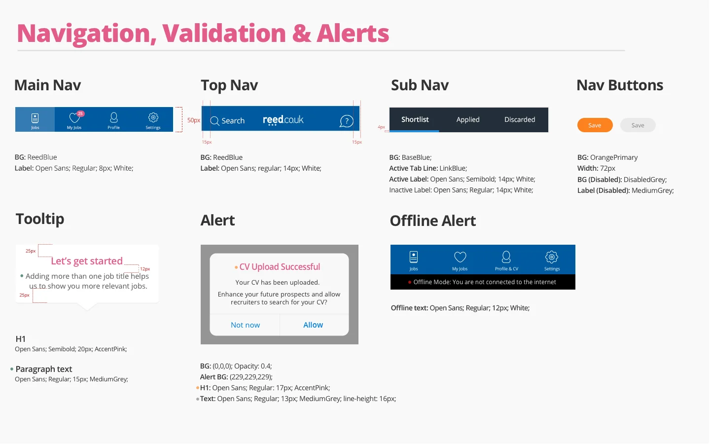
Design system
As there had not been an opportunity for any handover when I joined the team - and therefore, no assets or documentation - I decided to create a design system while redesigning the app. Basing it on the principles of atomic design, I created modular elements that were reusable, aiding the consistency and overall usability of the app.
The small coloured dots on the designs refer to text classes, which you can find at the foot of the second page; this was a system I came up with to mitigate handover problems with the development team. While this was a novel solution to the issue at the time, it took an inordinate amount of time to complete, and it's because of this that I championed the use of - and transition to - tools such as Sketch, Zeplin and Inspect from InVision into the broader design team.
Initially designing the app using Photoshop, I have since moved to sketch rendering the need for a document of this nature irrelevant - meaning some of the designs are now out of date. However, I wanted to include it here as a show of my commitment to doing whatever is necessary to work with the development team in realising the product vision.